B2B marketing website redesign | Marketing & conversion optimization

Overview
📍 Background
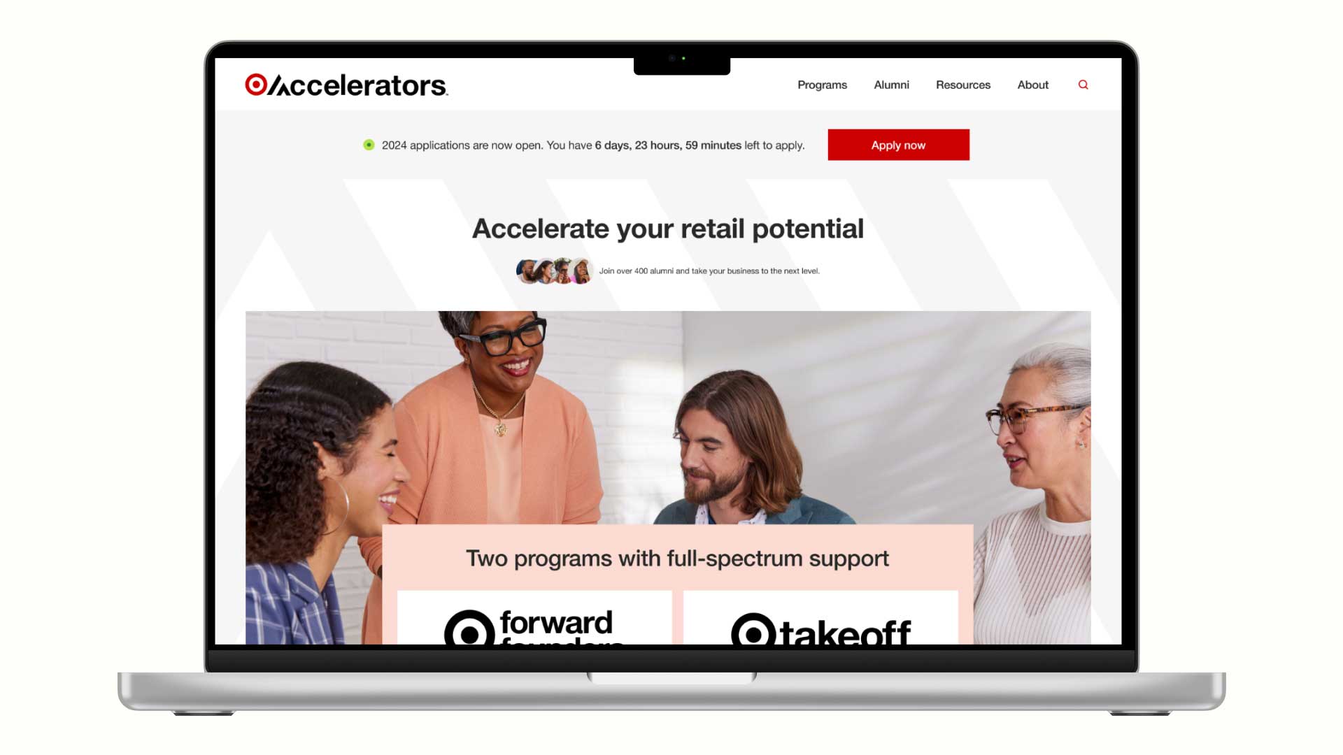
Target Accelerators helps product-based businesses grow through tools, coaching, and retail connections while giving Target access to fresh, innovative products for its shelves.
⚡ The challenge
Founders struggled to find and understand key program details. Common questions like “What is the time commitment?” and “What are the outcomes?” were buried deep in pages, leading to confusion, drop-offs, and support inquiries.
👩🏻💻 My role
- Lead UX/UI Designer and Content Strategist
- Team: Product strategist, developer, copywriter, brand designer
I led the UX and content strategy for a website redesign that clarified program options, streamlined navigation, and surfaced key information sooner, helping users find what they need faster and driving more program applications.
⭐️ The solution
The redesigned site makes program details easy to understand, reduces friction, and keeps founders engaged year-round. It builds trust, nurtures future applicants, and strengthens Target Accelerators’ lead pipeline.
🤔 How might we
How might we increase program applications and keep founders engaged year-round?
Research & insights
I reviewed website analytics, heatmaps, and ran interviews with both past participants and prospective applicants to identify where users dropped off and what stopped conversions.
⭐️ Key insights
- Navigation and program details were unclear, leaving founders confused about next steps
- Founders needed to know time commitment and expected outcomes before they could evaluate fit
- Different founders prioritized different information when evaluating fit—some wanted outcomes first, others curriculum or criteria
- Scannable text worked better than video: founders wanted to skim, not watch
- Free educational resources were highly valued and encouraged engagement
- Target’s brand carried instant credibility: founders wanted to be “on their radar”
- Success stories from relatable founders increased motivation
- Despite being time-intensive, the application process felt fair and worthwhile

Analytics showed strong engagement with program pages but minimal traffic to news and resources. During inactive application periods, lead generation efforts failed to convert. This disconnect between interest and conversion became central to our redesign strategy.

Scroll depth heatmaps indicated 60-70% of users never reached content below the midpoint. This finding drove our IA decisions: we prioritized founder-relevant information and conversion opportunities in the upper page sections where user attention was highest.

Click patterns showed users gravitating toward program schedules, benefits and outcomes, and qualifications. Video content was largely ignored. This behavioral data helped us prioritize the information founders actually needed versus what the organization assumed they wanted.

I partnered with the experience strategist to conduct moderated user interviews. We began with business context questions, then observed participants navigate the site while thinking aloud. We dug deeper into confused or high-interest moments to understand pain points, motivations, and goals.

Key user quotes helped stakeholders build empathy and understanding—tying decisions back to data.
Ideation & strategy
Using research insights, I restructured the site around what founders needed most to make a decision.
🎯 The goal
Make discovery intuitive and conversion easy.
👍 Prioritized
- Clear outcomes and time commitments: Founders couldn’t evaluate fit without knowing weekly hours and expected results
- Free educational resources: High engagement signal; kept founders connected during closed periods
- Success stories from relatable founders: Built trust and motivation more than generic marketing copy
- Simplified navigation: Reduced cognitive load by cutting unnecessary pages and clarifying labels
👎 Deprioritized
- Video content (founders preferred skimmable text)
- Lengthy brand storytelling in favor of founder-focused copy
- Pages that had little engagement or perceived value (less noise for founders and less maintenance for Target)

I streamlined navigation by consolidating pages, clarifying labels, and prioritizing high-value content. Program details are now upfront, helping founders quickly understand details and time commitment without digging through pages.

I created a content map to align hierarchy with user needs and business goals, giving the team clarity before moving into design.
Design & iteration
I conducted moderated usability sessions to test user flows and content clarity, uncovering pain points that guided refinements.
🎨 Key design decisions
- Reduced hesitation by unifying the “Apply Now” button
- Used tabbed navigation so founders could find information in their preferred order
- Reduced cognitive load with progressive disclosure
- Improved clarity with tooltips for unfamiliar program terms
- Built trust and motivation with featured success stories on the homepage
- Made high-value info more discoverable by streamlining navigation and refining labels
- Two-question lead capture active during open and closed periods
- Filterable resource library for fast access to relevant content

I tested layout options to identify what helped participants understand the program details and feel confident taking next steps.

I themed usability test insights to identify what was working in the new design and where users still struggled, prioritizing final refinements.

Founders hesitated on which program to apply to, not realizing Target would place them in the right one. I unified the program cards using the Law of Common Region and a single “Apply Now” button to remove confusion and signal that one application covered both programs.
Since different founders prioritized different information when evaluating fit, tabs let them navigate non-linearly based on their priorities while accordions reduced cognitive load by not overwhelming them with everything at once.

Tooltips were added to facilitate better understanding of industry terms that were unclear during testing.

Moderated sessions revealed past participant testimonials were a strong motivator for those considering the program. I moved success stories to the homepage to build trust early and show the program delivers real results.

I designed a simple two-question lead capture form to keep founders engaged during closed application periods, allowing Target to nurture their lead pipeline year round.

Interviews revealed founders wanted to hear from past participants they could relate to. I designed a filterable resource library that let them quickly access relevant content by business category, program, and business type.
Outcomes
7 of 7 research participants reported greater clarity and confidence compared to the original website.
The simplified navigation and upfront program details were designed to reduce support inquiries and increase qualified applications, addressing Target’s dual goals of attracting the right founders while reducing operational burden.
Founders described the site as “clear”, “user-friendly”, and “easy to navigate”.
Stakeholders approved the design and said the design “exceeded our expectations for clarity and usability.”
🚀 Post-launch
As an agency project, I transitioned off before post-launch metrics were available. However, 3+ years later the website is still using the lead capture flow and resource library I designed, proof of lasting effectiveness in growing an engaged lead pipeline.
💡 Key learning
Good design removes the need to convince. When I made program details scannable and outcomes clear, founders stopped needing to reach out for answers. They could evaluate fit and apply confidently on their own. The best conversion optimization isn’t persuasion, it’s clarity.